Replacing a tile backsplash means mortar, grout, and a weekend you'll never get back. Peel and stick wallpaper gives you the same visual impact in an afternoon — and you can change it the moment you want something new. Below are eight kitchen backsplash ideas, each built around a specific style, with designs that work exactly for that aesthetic.
Quick Answer
Peel and stick wallpaper works as a kitchen backsplash, accent wall, pantry feature, and inside open cabinets. Apply to smooth, clean walls away from direct flame — it wipes clean and removes without wall damage. Below: 8 styles with specific design picks for each.
1. Geometric & Tile Patterns: The Classic Backsplash Look

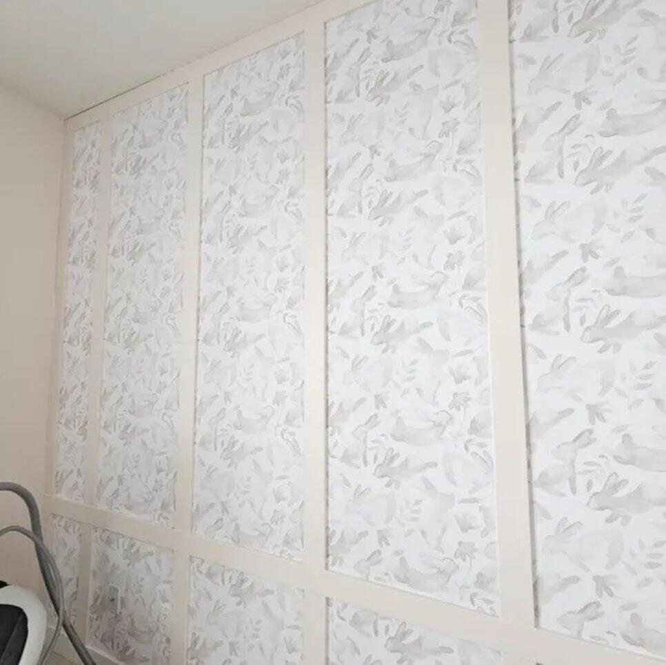
Herringbone and chevron are the most searched backsplash patterns for a reason — they have the rhythm and structure of real tile, but bring a handcrafted quality that standard subway tile doesn't. They work in almost every kitchen style: modern, farmhouse, transitional, Scandinavian. The pattern does enough visual work on its own that the surrounding space can stay entirely neutral.
Beige and warm-toned herringbone is the natural choice for warm kitchens — wood countertops, brass hardware, cream or off-white cabinets. Green herringbone shifts the same geometry toward something more organic and current, sitting beautifully against white cabinets, natural stone, and matte black fixtures.


Designer Tip
Herringbone wallpaper works especially well inside open shelving and glass-front cabinets — the diagonal pattern in a framed space reads like a custom tile inset. Use it on the back panel of a single cabinet for a detail that makes the whole kitchen feel more designed.
2. Marble & Stone Look: Instant Luxury Without the Price Tag

Marble backsplashes read as high-end regardless of what surrounds them. Against white shaker cabinets they're crisp and classic. Against dark navy or forest green cabinetry they become a dramatic contrast. The key is the veining — a design with strong, directional veining in gold or grey creates the same effect as slabs of real stone, at a fraction of the cost and none of the installation headache.
This style works best in kitchens where the rest of the design is kept quiet: neutral countertops (white quartz, light concrete, pale wood), simple hardware, and minimal pattern elsewhere. The marble does the talking — everything else plays a supporting role.


Designer Tip
Extend marble wallpaper slightly beyond the backsplash zone — up the wall between upper cabinets if there's a gap, or wrapping a small section around a corner. The continuity makes it read more like a real stone installation than a wallpaper application.
3. Fresh & Fruity Kitchen Prints: Colour With a Reason

A kitchen backsplash that references food is one of the most natural design choices you can make — and one of the most underused. Lemon and avocado prints bring Mediterranean warmth and a sense of abundance that feels completely at home in a cooking space. These designs work best in kitchens that lean into colour: sage green cabinets, warm terracotta tones, pale yellow walls, or the classic white-and-wood combination where the backsplash becomes the single pop of colour in the room.
The watercolour rendering of these prints is key — it gives them a softness and hand-painted quality that reads as considered rather than novelty. Against a white subway-tiled splashback these would look out of place; against white cabinets and a butcher block countertop, they look exactly right.


Designer Tip
Fruit and botanical prints have a white or off-white background that keeps them from feeling heavy. Use them on the full backsplash run — they have enough white space built into the pattern that even a long stretch stays fresh rather than overwhelming.
4. Mediterranean & Moroccan: Colour and Pattern Done Right

Moroccan tile is the backsplash idea that never goes out of style — and for good reason. The interlocking geometry and warm palette reference a centuries-old design tradition that reads as both pattern-forward and completely timeless. In a kitchen, it brings colour and structure simultaneously, which means the cabinetry can stay entirely neutral and the backsplash still creates a complete-looking design.
This style is the natural fit for Mediterranean, eclectic, and maximalist kitchens — think terracotta floor tiles, raw plaster walls, copper or unlacquered brass fixtures, open wooden shelving. A colourful brick print takes the same energy in a more industrial direction: exposed-look surfaces that give a city apartment kitchen genuine character rather than a showroom finish.


Designer Tip
Moroccan tile patterns have a strong repeat with a distinct visual centre. Start the first panel at the midpoint of the wall so the pattern is symmetrically positioned — centred above the sink or the hob rather than starting randomly at one edge.
5. Terrazzo & Textured Stone: The Backsplash Trend With Staying Power

Terrazzo had its revival moment and never actually left. The scattered stone pattern — originally an architectural floor and surface material — translates brilliantly to a backsplash because it has the visual density of real material without being busy. Terracotta and orange terrazzo brings warmth and a slightly artisanal quality that pairs beautifully with warm wood countertops, sage green cabinets, or terracotta-coloured lower units. Neutral stone textures work in cooler kitchens — white, grey, or pale blue cabinetry with chrome or brushed nickel fixtures.


Designer Tip
Terrazzo patterns have a random, non-directional repeat — which makes them the most forgiving of any wallpaper to install. There's no pattern alignment to manage across panels, and small misalignments are completely invisible. Ideal for a first-time installation.
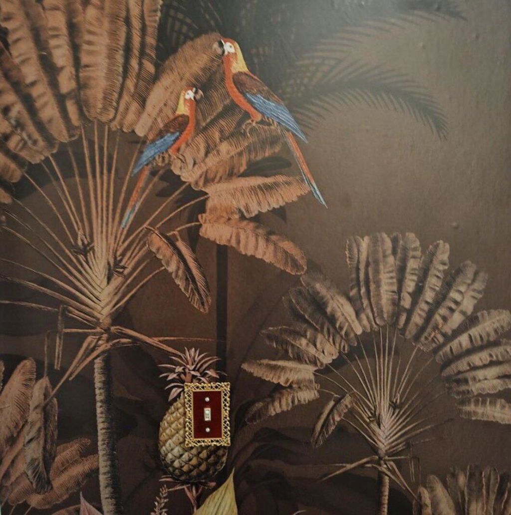
6. Vintage & Classic: Birds, Botanicals and Timeless Prints

Vintage bird patterns and classic botanical illustrations bring a sense of history and craft to a kitchen that no modern tile can replicate. These designs are especially at home in period properties, kitchens with aged brass or antique copper hardware, painted shaker cabinets in heritage greens or blues, and spaces with natural stone countertops.
The hand-drawn quality of these prints — delicate linework, layered foliage, illustrated birds — gives them a warmth and depth that printed geometric patterns simply don't have. Against white or cream cabinets they feel fresh; against darker cabinetry they create a rich, layered effect.


Designer Tip
Vintage bird and botanical prints work exceptionally well inside glass-front cabinets — the illustrated detail reads beautifully through the glass and turns storage into a display. Paper just the back panel of one or two cabinets for an effect that looks completely intentional.
7. William Morris: The Kitchen That Feels Genuinely Curated

William Morris prints have been considered timeless for over 150 years — and they translate to a kitchen backsplash better than almost any other heritage pattern. The density of botanical detail, the richness of the greens, and the hand-drawn intricacy give these designs a quality that reads as genuinely curated rather than simply decorated.
These prints work best in kitchens that lean into the heritage aesthetic: painted shaker cabinets in deep green, navy, or off-white; natural stone or butcher block countertops; aged brass or unlacquered copper fixtures. Against a plain white kitchen they become the single most considered element in the room — which is exactly what a backsplash should be.


Designer Tip
William Morris patterns have very high visual density — they need breathing room. Use them on one wall only, keep everything else in the kitchen plain, and let the pattern carry the entire design. The more restrained the surroundings, the more the Morris print lands.
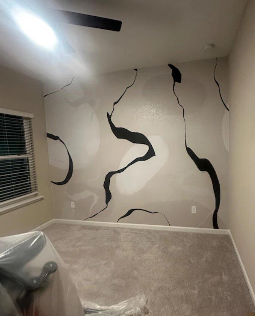
8. Modern & Minimalist: Clean Lines, Quiet Impact

Modern kitchens — handleless cabinets, flat surfaces, monochrome palette — don't need a backsplash that shouts. What they need is one that adds texture and interest without disrupting the clean geometry the rest of the space is built on. A green and white abstract line print does exactly this: it reads as a subtle, hand-drawn texture from a distance and reveals its detail up close.
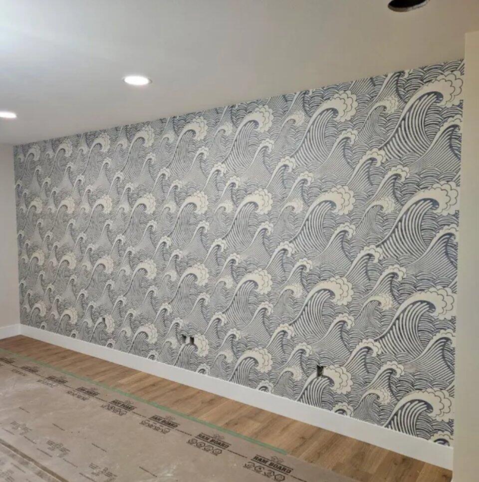
For something bolder on a single accent wall — the end wall of a galley kitchen, the wall behind open shelving, or above a breakfast bar — a Japanese wave mural creates a full-scale moment that no repeating pattern can match. It works beautifully with dark or navy blue cabinets, unlacquered brass fittings, or natural wood elements.


Designer Tip
In a minimalist kitchen, one wallpapered wall is enough. The one behind the hob or the sink — extended full height — makes the statement. Spreading the pattern to all walls turns considered texture into visual noise. Restraint is what makes the minimal approach work.
Find Your Kitchen Style
Browse the full collection of kitchen wallpaper and wall murals — peel and stick, removable, and ready to transform your space this weekend.
Shop Kitchen Wallpaper