Choosing the right wallpaper color can be both exciting and overwhelming. With so many beautiful designs and shades available, it's easy to get lost in the options. This guide will help you navigate through wallpaper color combinations and choose the best tones for your room, personality, and mood.
1. Start with Your Interior Style or Mood
Before searching for wallpaper by color, ask yourself: what kind of space are you creating? Is it minimalist and calm? Bright and playful? Dark and moody? Your interior style should guide your decision.
For example:
- Boho or coastal interiors pair beautifully with warm neutrals, sandy beige, and ocean blues.
- Modern minimalism loves black and white or grey tones.
- Retro or vintage rooms may benefit from mustard yellow, burnt orange, or soft green.
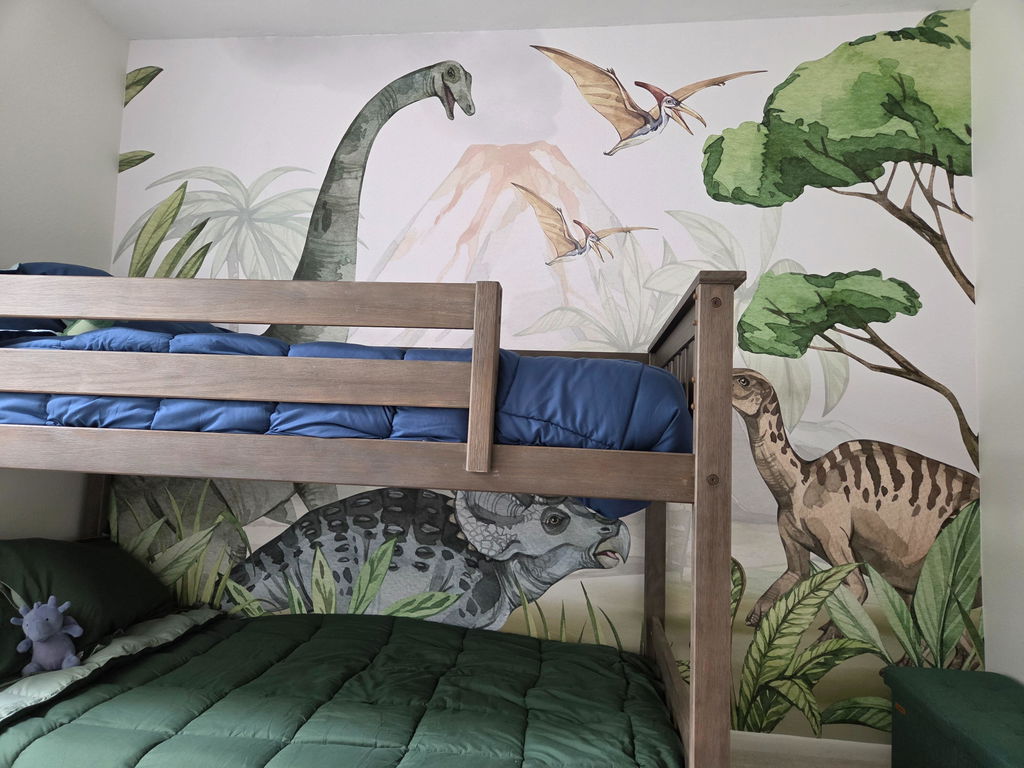
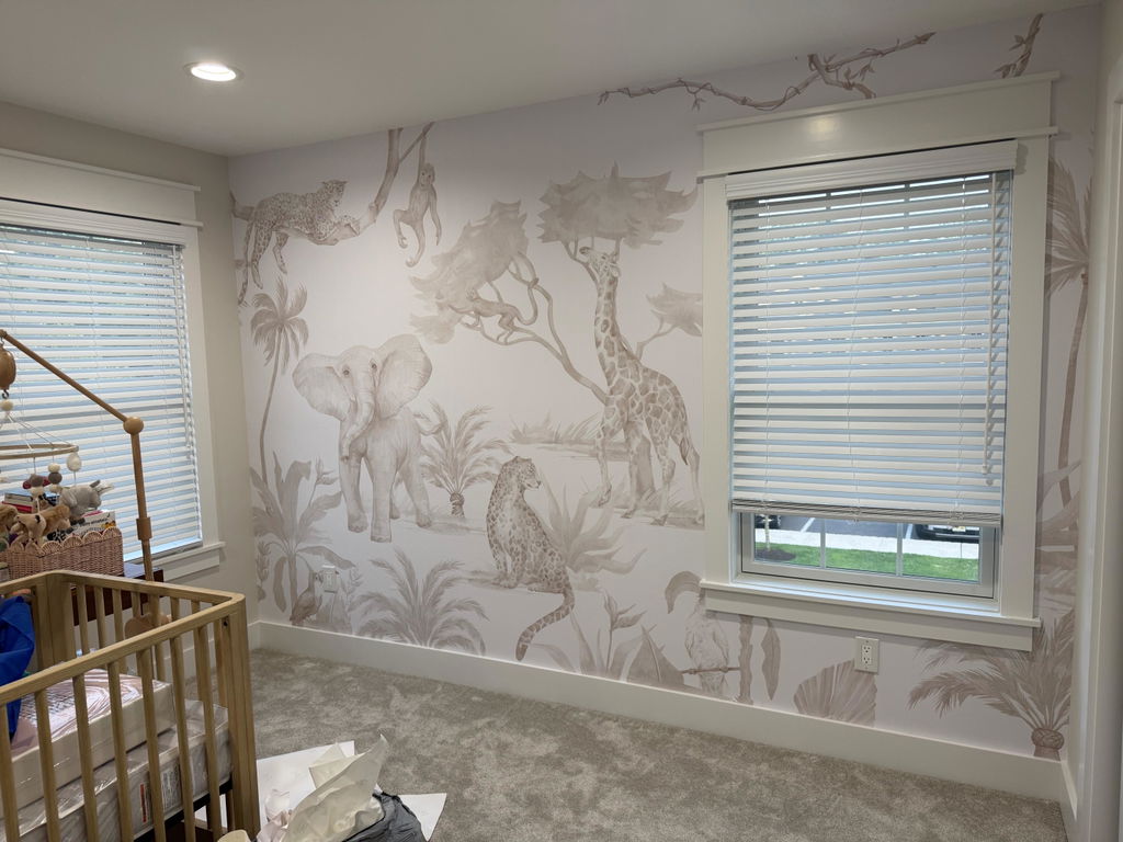
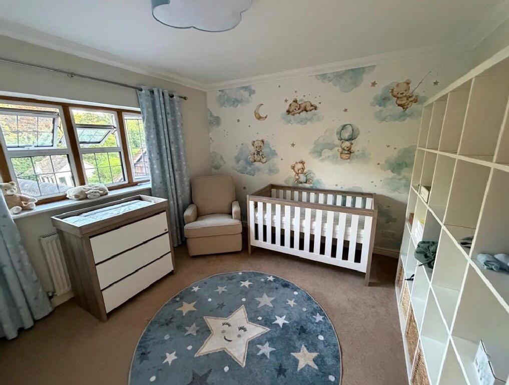
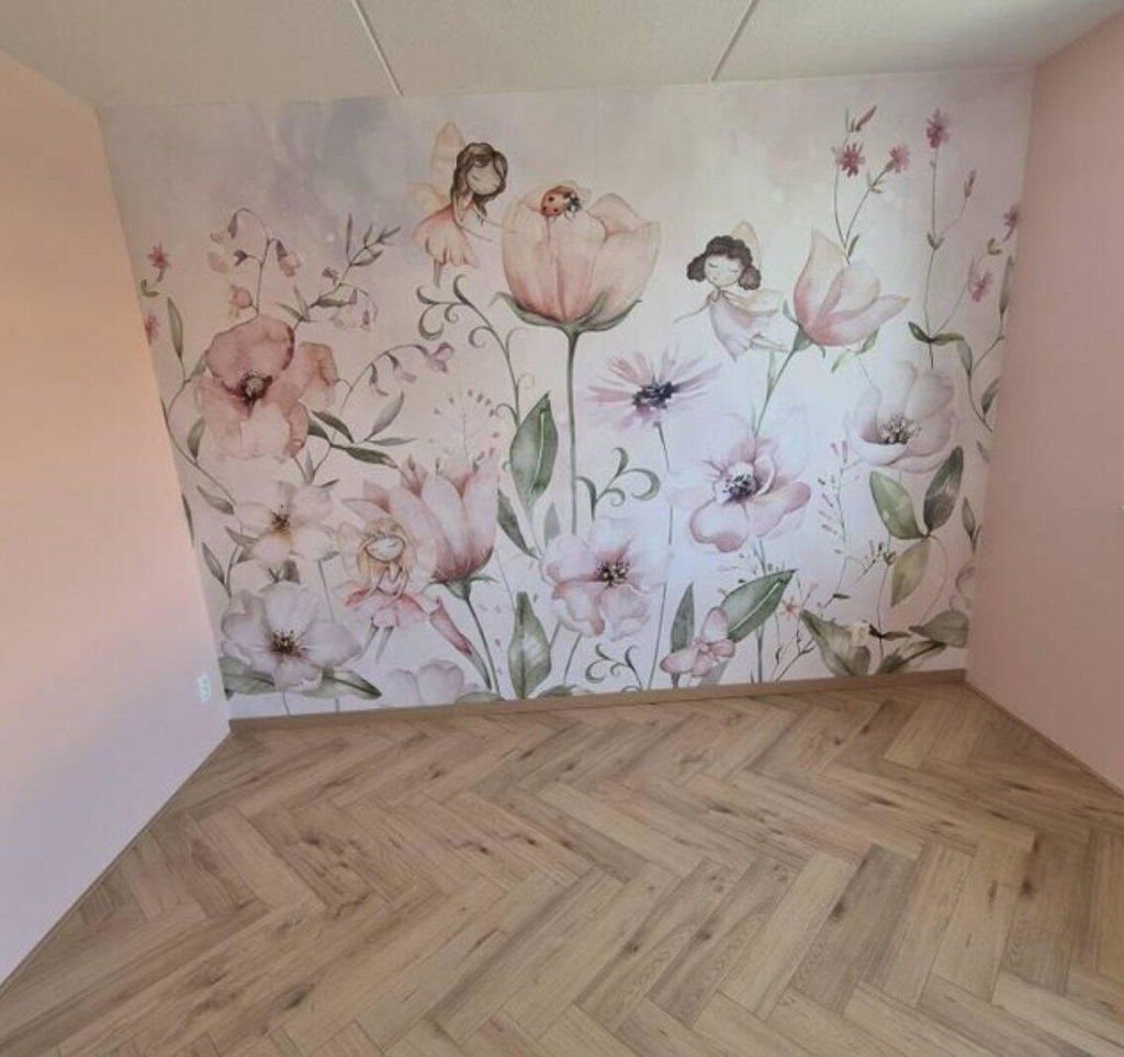
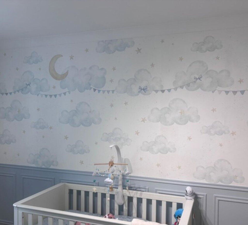
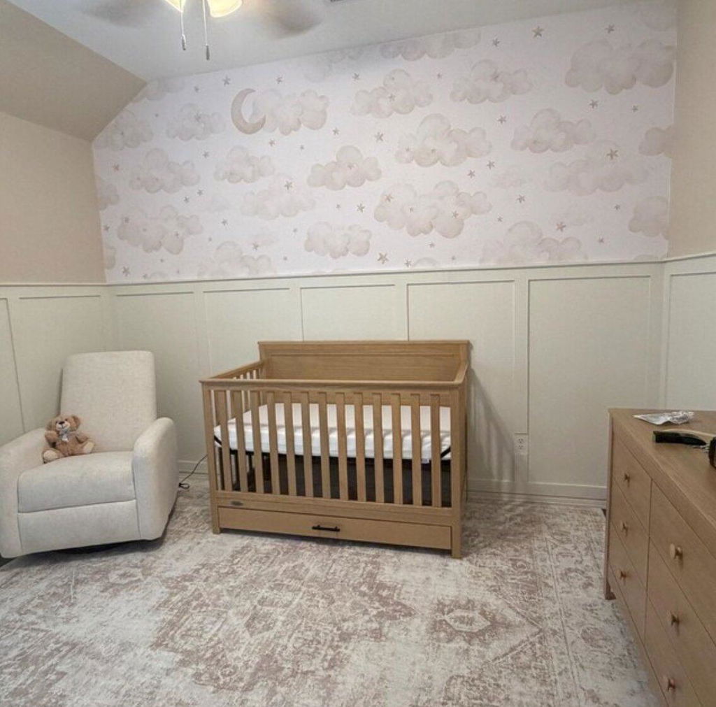
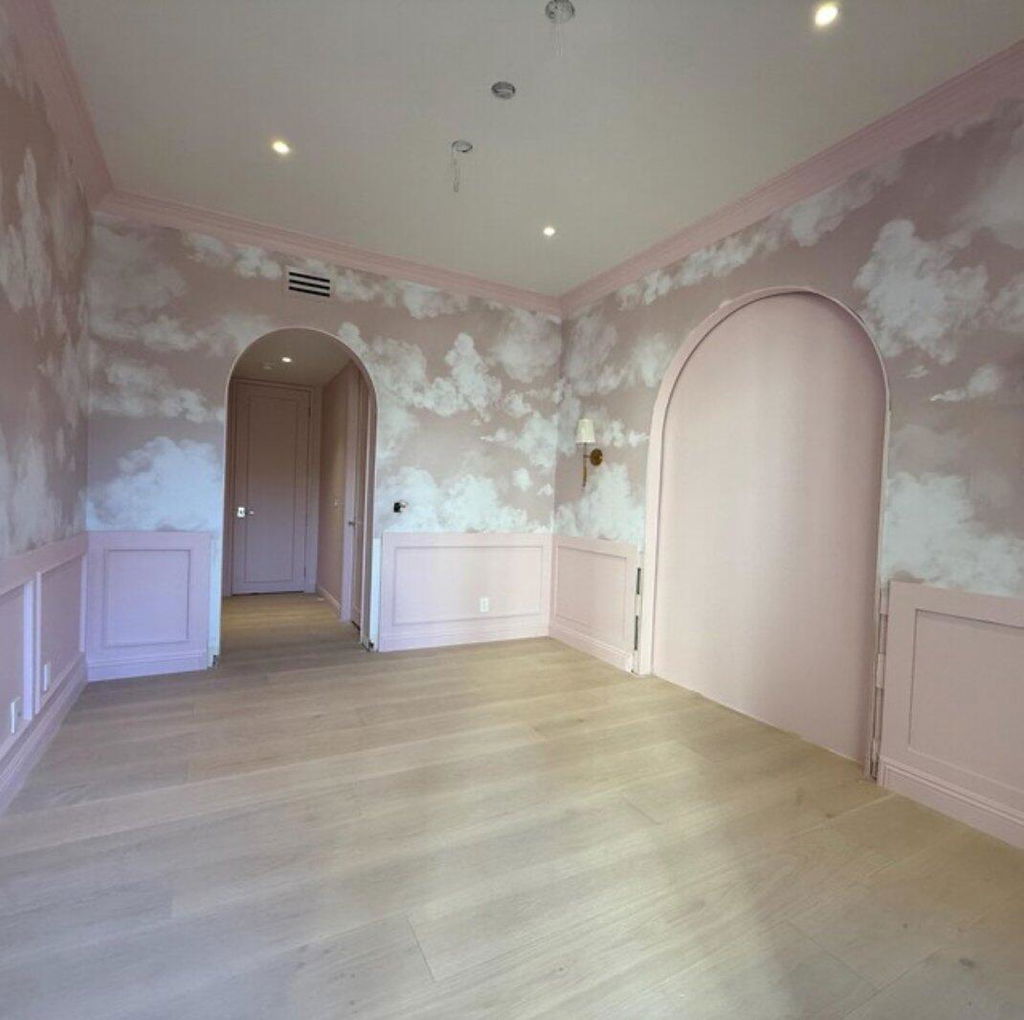
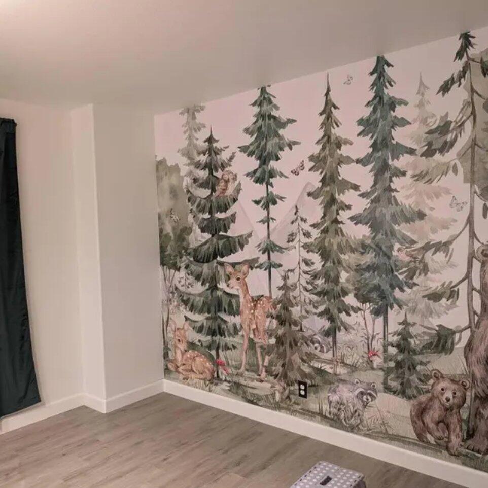
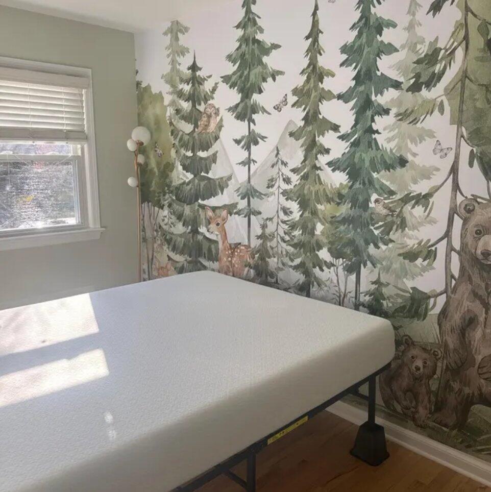
- Children’s rooms are perfect for soft pastels or cheerful, saturated shades.
Knowing your style helps you search wallpaper by color with more clarity.

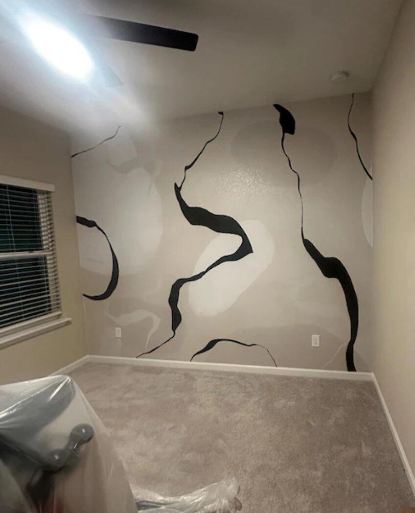
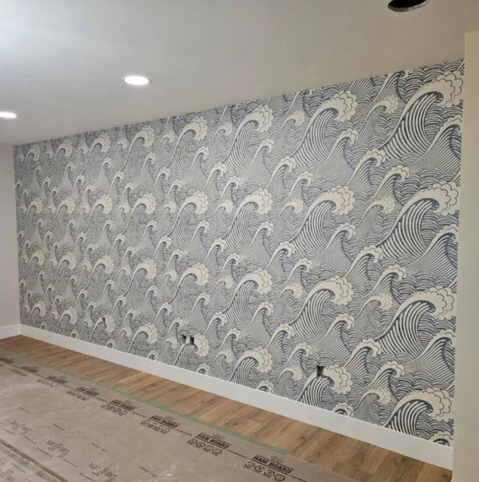
2. Understand Pattern & Background Balance
Most wallpapers combine two main elements: the pattern color and the background color. A safe, timeless choice is a bold pattern on a light or neutral background. But what if you want something custom?
Here’s how to make your own wallpaper color combination work:
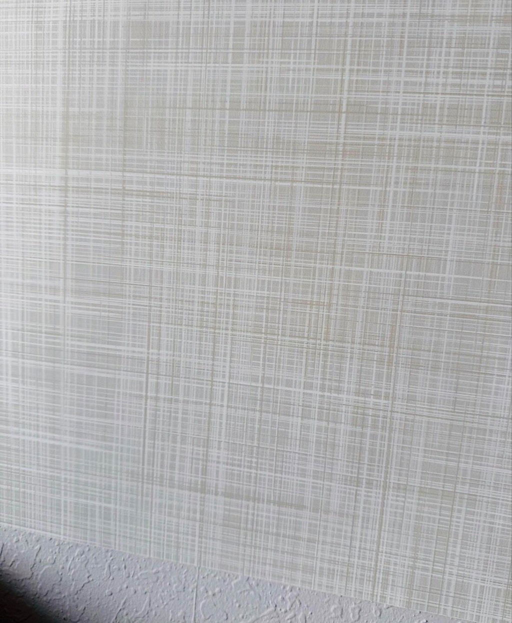
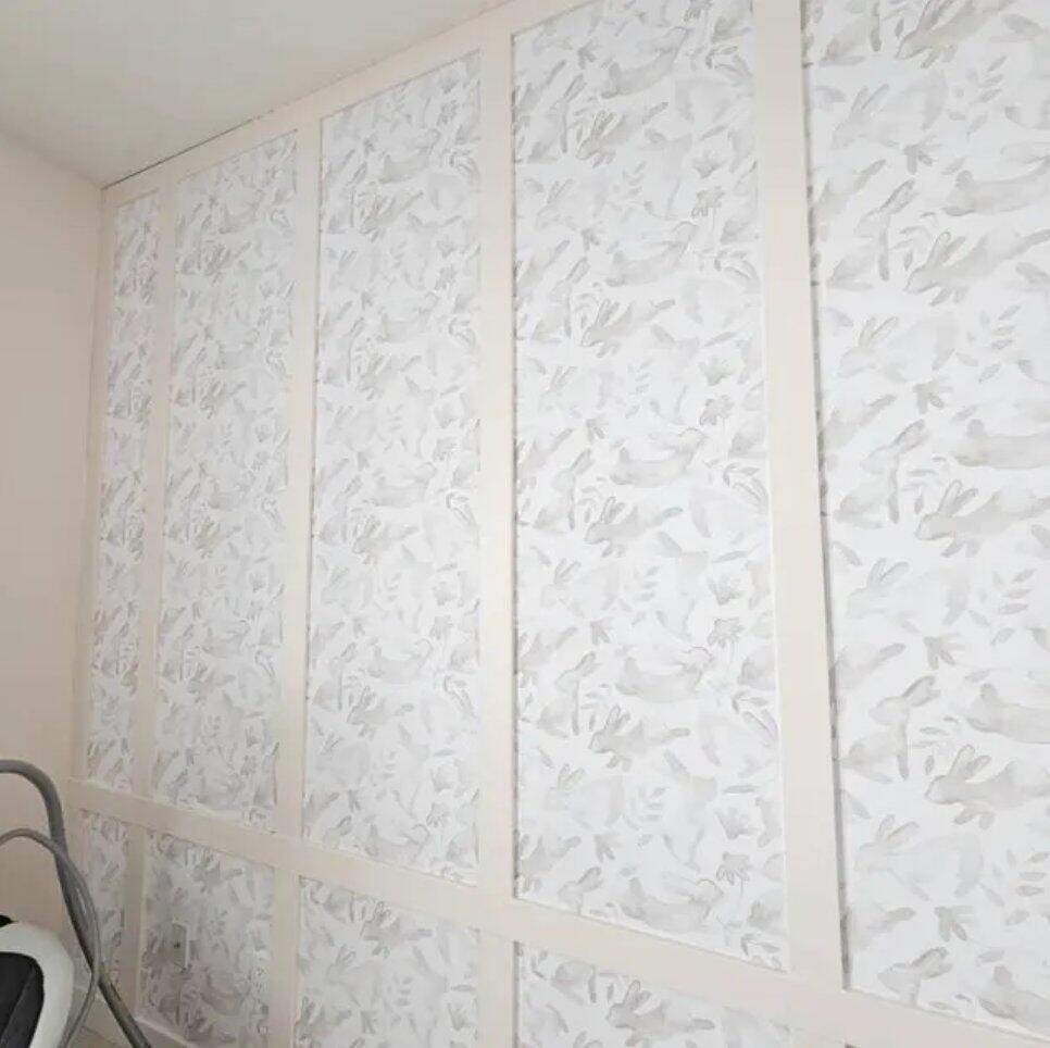
- If both the pattern and background are light (like mist + cream), the result will be subtle and soft – ideal for understated elegance.
- If both are dark or saturated (like navy + forest green), it can create a rich, dramatic effect – great for statement walls.
-
Avoid pairing two colors with similar saturation unless the pattern is bold enough to stand out.
Remember, the pattern scale also plays a role:
- Thin lines on a dark background may disappear.
- Large, chunky designs are more forgiving with bold color pairings.

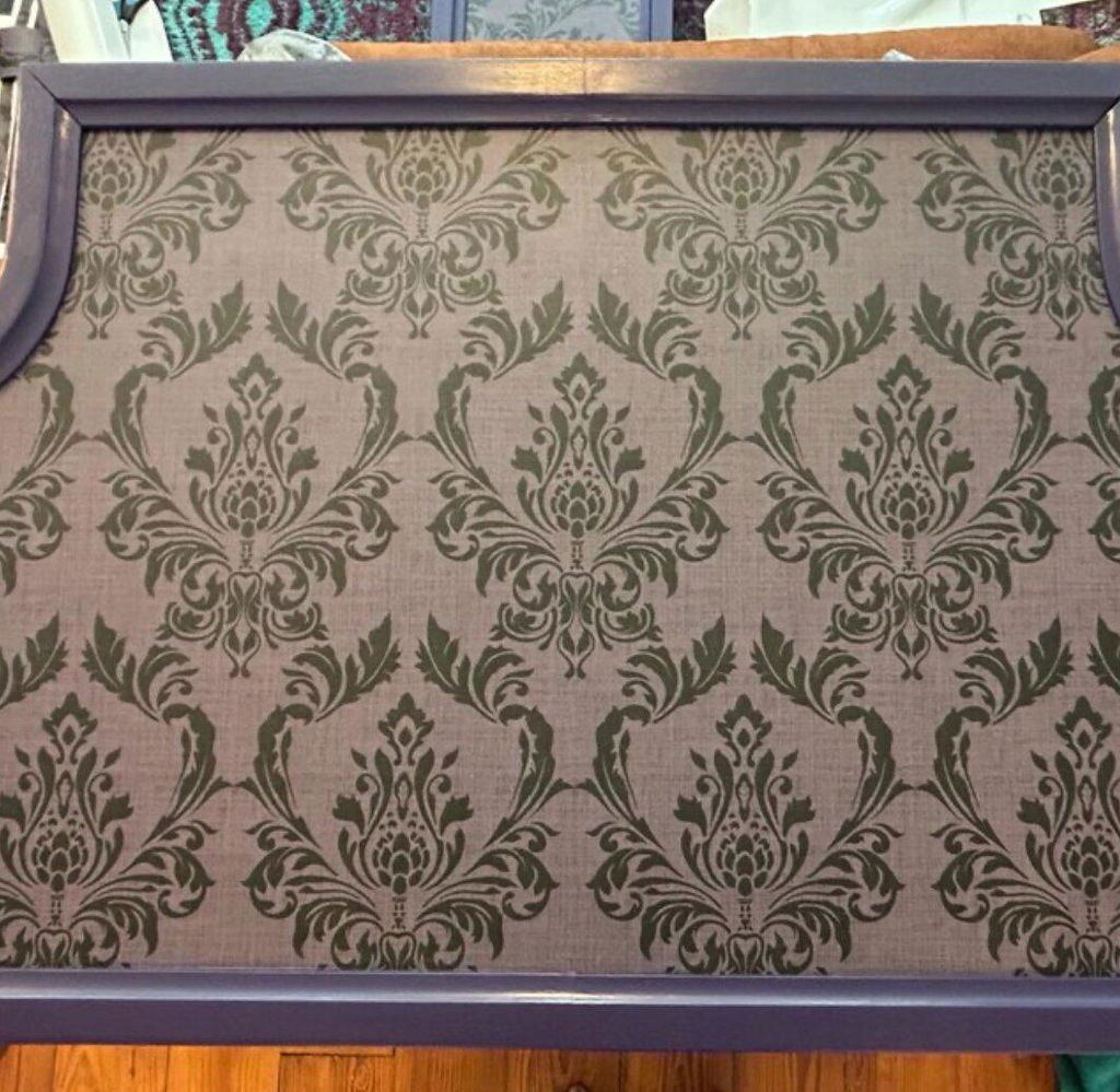
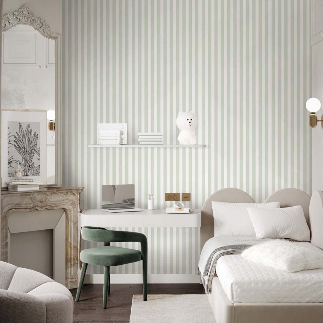
3. Stick with Harmonious Monochromes
Not sure which color is best for wallpaper? Try a monochrome color scheme – shades of the same color family. It’s a safe and sophisticated approach. For example:
- Soft blush + dusty rose + mauve
- Sky blue + denim + navy
- Sage + mint + forest green
These layered tones add depth without clashing. They’re ideal for living rooms, bedrooms, and cozy corners.

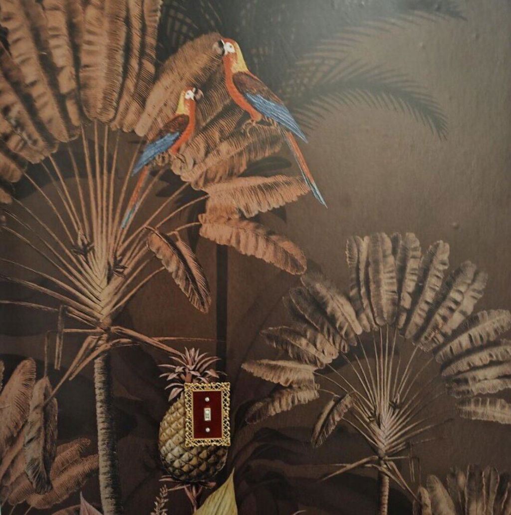
4. Match Wallpaper to Existing Elements
Another way to pick the right color is to match your wallpaper to existing furniture, flooring, or even artwork. Have a terracotta sofa or a painting with lavender accents? Use those as your palette inspiration.
CostaCover wallpapers can be the perfect anchor for a room’s aesthetic. Choose peel and stick designs in hues that echo your favorite pieces – it’s an easy way to tie everything together.

5. Use Light and Space to Guide You
The size and lighting of your room will influence how wallpaper colors appear:
- Smaller rooms benefit from lighter colors to open the space.
- Rooms with lots of natural light can handle deeper or bolder tones.
- Dark corners come alive with soft pastels or reflective textures.
If you’re unsure, start with neutral backgrounds and add a hint of color in the pattern.
Final Tips from CostaCover Designers
✔️ Choose two dominant colors – one for pattern, one for background
✔️ Check how colors look in daylight vs evening
✔️ Think about the room’s purpose – soothing tones for bedrooms, energizing hues for kitchens
✔️ Request mockups or samples to test combinations in real life
There’s no one-size-fits-all answer to how to pick a wallpaper, but a thoughtful approach will help you discover the design that feels just right.
Need Inspiration?
At CostaCover, we offer hundreds of peel and stick wallpaper designs across all color families. Whether you’re after warm earthy tones, dreamy pastels, or bold color-blocked patterns, we’ve got something to suit your space.